

Dashboards
The Dashboard is your central hub for navigating the platform. From here, you can access the Profile, Climate, Environment & Social, and Labour dashboards, each offering focused insights to help you better understand and manage specific areas of performance.
Profile
The Profile section allows you to view and manage your personal and organisational information, helping you keep your details up to date and tailor the system to your needs.
When you open the dashboard, it will default to the Profile section, where you’ll see the following:
Manage your Company
- Company Information: You can view and edit company information.
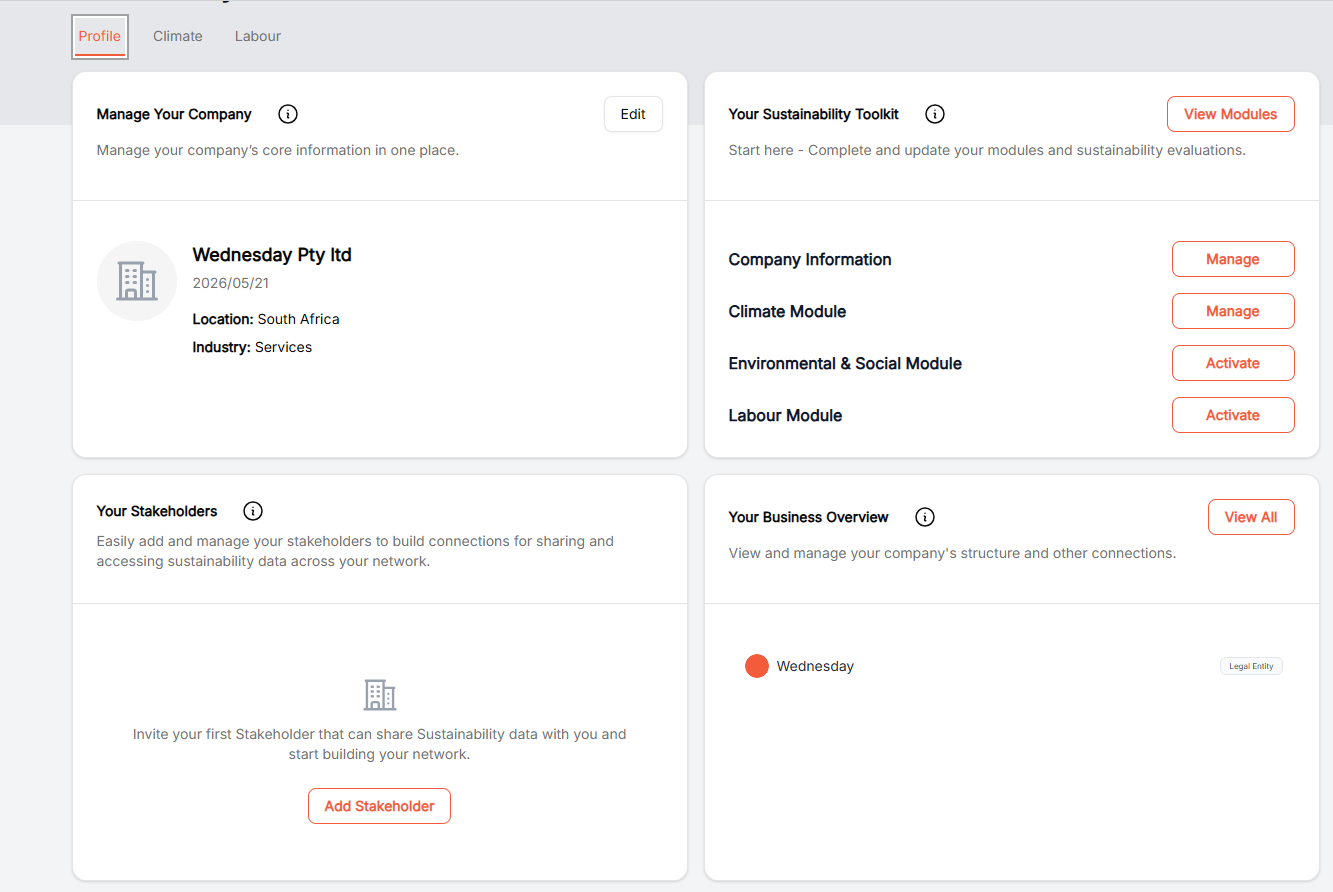
- Under “Manage your company” you can update your company information by clicking edit.
Your Sustainability Toolkit
- This feature provides direct access to your modules, allowing you to easily capture sustainability data and navigate the platform more efficiently.
Your Stakeholders
- Use the Your Stakeholders card to quickly access stakeholder management tasks, such as adding and managing stakeholders, directly from the Dashboard. This shortcut provides a faster way to access the Stakeholders section when needed.
Your Business Overview
- The Your Business Overview card offers quick access to the stakeholders connected to your organisation, including customers, suppliers, and other business relationships. Use this shortcut to efficiently view and manage these connections directly from the Dashboard.
Climate
The Climate dashboard gives you a comprehensive view of your organisation’s sustainability performance, including your overall climate score, data quality, and key pillars such as governance, risk management, strategy, and metrics and targets. It also allows you to track assessment progress, compare performance against industry benchmarks, and access both starter and advanced climate assessments to guide your sustainability journey.
Starter Climate Assessment.
The Starter Climate Assessment is designed to give you a quick, high-level view of your organisation’s climate maturity by capturing essential information across key areas like governance, risk, and strategy making it ideal if you are early in your sustainability journey or need a baseline to understand where you stand.
Advanced Climate Assessment.
The Advanced Climate Assessment, on the other hand, is more detailed and data-intensive, enabling deeper analysis, more accurate scoring, and stronger alignment with recognised sustainability frameworks, so you should choose it when you have more mature processes, reliable data, and a need for comprehensive insights to support reporting, benchmarking, and strategic decision-making.
What does this dashboard Show?
- The dashboard is evaluating the organization’s climate maturity and performance.
- It uses a scoring framework across multiple categories.
- The scores benchmark the organisation against industry expectations (Endura benchmarks).
Headline Scores
Overall Climate Score: 71 / 100
- This is the aggregated score across all categories.
- Indicates good progress but still gaps vs best practice.
Category Scores Breakdown
These are the four pillars of the assessment, each with its own weighting.
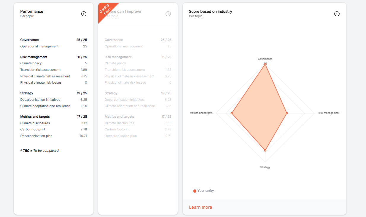
Governance: 25 / 25
This would mean:
- Strong leadership oversight.
- Policies and accountability structures in place.
- Climate embedded in decision-making.
Risk Management: 11 / 25
Indicates:
- Limited climate risk identification or measurement.
- Weak integration into enterprise risk frameworks.
- Possibly lacking scenario analysis or stress testing.
Strategy: 19 / 25
Indicates:
- Some climate strategy exists.
- Possibly aligned to business objectives.
- Not fully comprehensive or deeply embedded.
Metrics & Targets: 17 / 25
Indicates:
- Some KPIs and targets exist.
- Could be more accurately tracked
- Bottom Graphs.
Each category includes a bar chart labelled:
- Your entity → orange bar.
- Endura benchmark → grey/black bar.
- What this shows is how Your company performs vs industry peers.
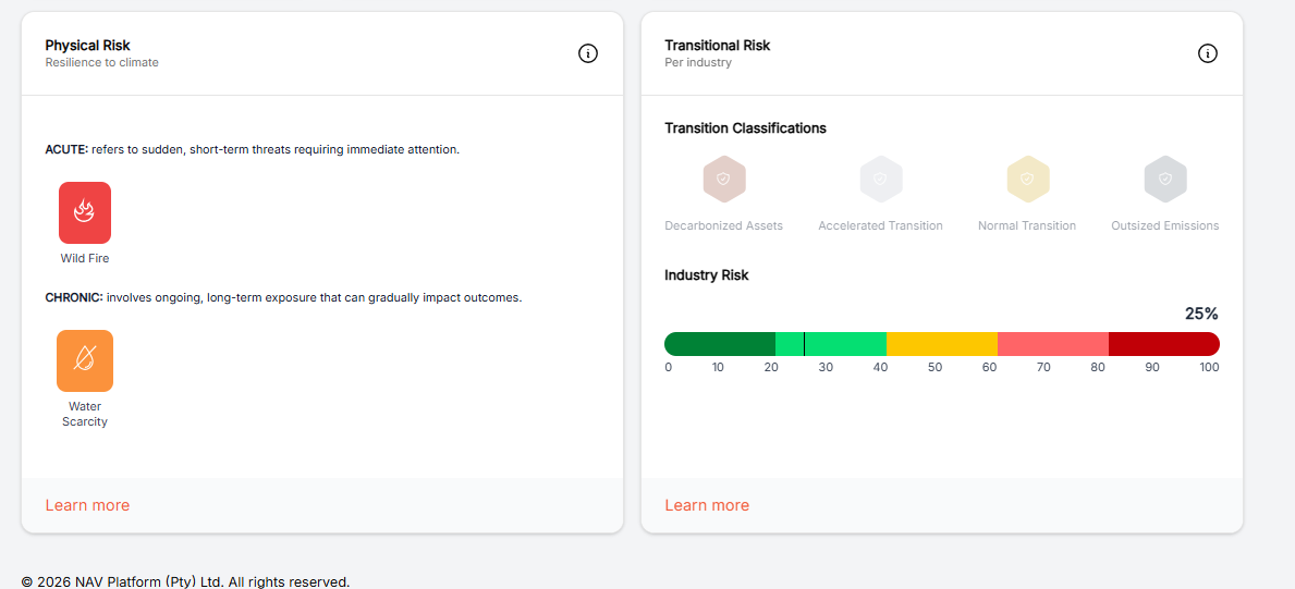
At the bottom of the page, there are Physical and Transitional Risks to view as well, which highlight the potential risks specific to your location and industry. Physical risks refer to the direct impacts of climate change such as extreme weather events, flooding, droughts, or rising temperatures while transitional risks relate to the shift toward a low carbon economy, including regulatory changes, market pressures, and evolving technology that may affect how your business operates.
Carbon
The Carbon dashboard gives you a clear view of your organisation’s total carbon emissions, broken down into Scope 1 and Scope 2, along with trends over time to help you track changes in your environmental impact. It also shows emissions intensity relative to revenue and compares your performance against global averages, helping you understand how efficiently your business operates. In addition, data quality indicators highlight how reliable your emissions data is, enabling you to identify gaps and improve the accuracy of your sustainability reporting and decision-making.
To navigate to the Carbon dashboard, click on carbon.
Scope View
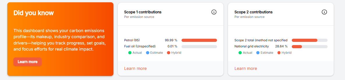
What does this dashboard show?
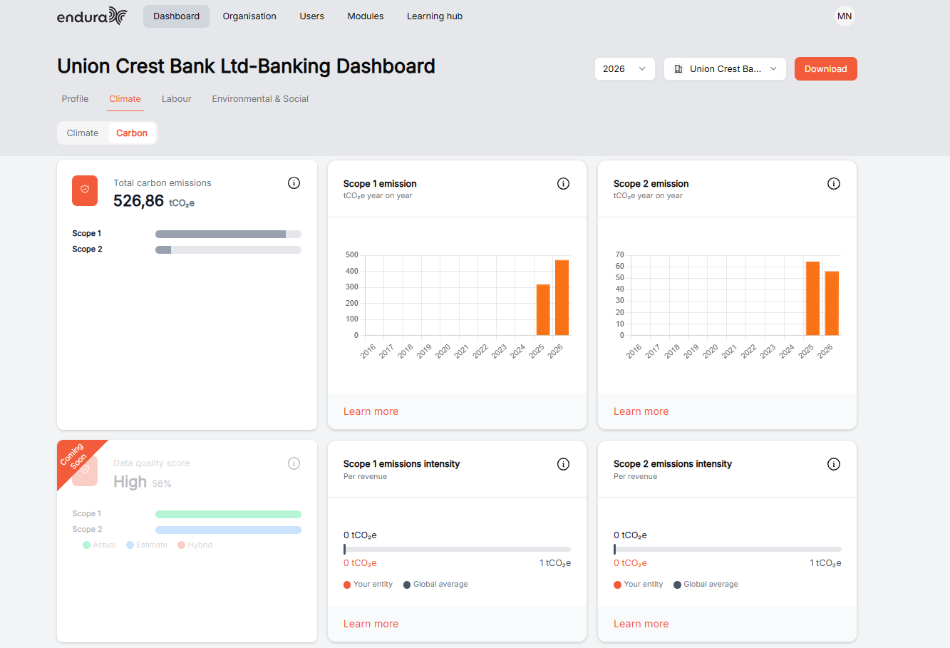
This screen gives you a quick view of the bank’s carbon emissions (environmental impact) for the selected year.
Total emissions
526.86 tCO₂e = total carbon footprint
This includes:
- Scope 1: Direct emissions (e.g. fuel).
- Scope 2: Indirect emissions (electricity use).
Key Takeaway: This is the bank’s overall environmental impact for the year.
Emissions over time
There are two charts:
Scope 1
- Shows direct emissions each year.
- Recent years are higher.
Scope 2
- Shows electricity-related emissions.
- Also high in recent years.
Key Takeaway: Emissions have increased recently this could be from:
- More activity, or better data tracking.
What is driving emissions
- Scope 2 is bigger than Scope 1.
- Key Takeaway: Most emissions come from electricity usage, not fuel.
Data quality
- 86% (High).
- Key takeaway: The data is mostly accurate and reliable, with only a small portion estimated.
Emissions intensity
- Shows emissions compared to revenue.
- Compared with a global average
- Key takeaway: The bank appears efficient (lower emissions relative to its size).
In summary*: This dashboard shows how much carbon the bank produces, what is causing it, and how well it is performing compared to others.*
E&S
The Environmental & Social dashboard provides a consolidated view of your organisation’s performance across key E&S dimensions, including your overall E&S score, pillar-level performance (Governance, Risk Management, Strategy, and Metrics & Targets), and benchmarking against industry peers. It enables you to understand how well your organisation manages environmental and social risks, track assessment progress, and identify areas for improvement.
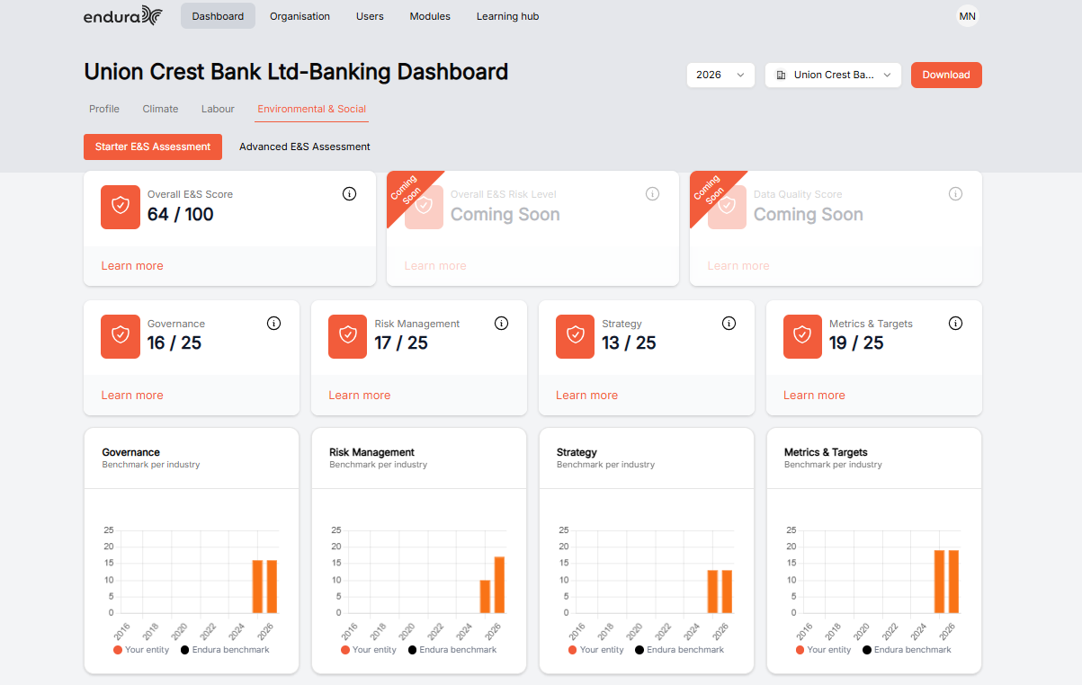
Starter E&S Assessment
The Starter E&S Assessment gives you a high-level view of your organisation’s Environmental and Social maturity by capturing essential information across governance, risk, strategy, and performance areas. It is ideal when you need a quick baseline to understand your current position and begin identifying key gaps.
Advanced E&S Assessment
The Advanced E&S Assessment offers a more detailed and comprehensive evaluation, enabling deeper insights into environmental and social practices with more granular data inputs. It is best suited for organisations with more mature processes and data, supporting robust benchmarking, improved scoring accuracy, and alignment with sustainability frameworks.
Dashboard Components
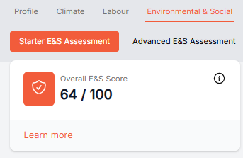
Overall E&S Score
This score (e.g., 64 / 100) represents your organisation’s overall Environmental and Social performance based on the assessment inputs. It provides a quick snapshot of maturity and highlights how well your organisation is addressing E&S risks and opportunities.
Pillars
These four pillars break down your performance into key focus areas:
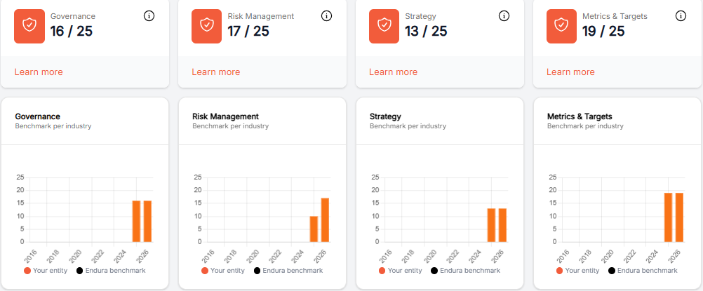
Governance (e.g., 16 / 25)
- Reflects how well environmental and social responsibilities are structured, overseen, and embedded within leadership and policies.
Risk Management (e.g., 17 / 25)
- Shows how effectively your organisation identifies, assesses, and mitigates environmental and social risks.
Strategy (e.g., 13 / 25)
- Indicates how well E&S considerations are integrated into your long-term business strategy and decision-making.
Metrics & Targets (e.g., 19 / 25)
- Measures how clearly you track performance through KPIs and whether you have defined targets to drive improvement.
Benchmarking
Each pillar includes a benchmark comparison chart, where:
- Your entity (orange bars) shows your organisation’s performance.
- Endura benchmark (black marker) represents the industry average.
This allows you to quickly see where you are outperforming or lagging behind peers, helping prioritise improvement areas.
Performance
- The Performance section gives a more detailed breakdown of scores within each pillar (e.g., operational management under Governance). This helps you pinpoint exactly where performance is strong or where specific improvements are needed.
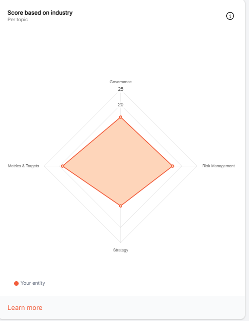
Score Based on Industry
- This section contextualises your performance by comparing your scores against organisations in the same industry. It helps you understand whether your results are competitive or if additional focus is required to align with industry expectations.
Labour
The Labour dashboard provides you with an overview of your organisation’s labour and social sustainability performance, including an overall labour score and key areas such as governance, risk management, strategy, and metrics and targets. It helps you identify gaps and track how your practices compare against industry benchmarks, giving your insight into how well you manage workforce-related risks and responsibilities. By using the starter or advanced assessments, you can progressively improve your labour practices and support more responsible, compliant, and ethical operations.
Starter Assessment
The Starter Labour Assessment is designed to give you a quick, high-level understanding of your organisation’s labour practices by focusing on core areas such as governance and basic risk management, making it ideal if you are just beginning to assess your social and workforce-related performance.
Advanced Assessment
The Advanced Labour Assessment is more comprehensive and detailed, requiring deeper inputs across strategy, metrics, and targets, and is better suited for organisations with more established processes that want to benchmark performance, strengthen compliance, and drive continuous improvement.
Dashboard Components
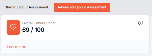
Overall Labour Score
- This score (e.g., 45 / 100) represents your organisation’s overall labour and workforce performance based on the assessment inputs. It provides a quick snapshot of maturity and highlights how effectively your organisation is managing workforce-related risks and opportunities.
Pillar Scores
These four pillars break down your performance into key workforce focus areas:
Governance (e.g., 16 / 25)
- Reflects how well labour responsibilities, policies, and oversight structures are defined and embedded within leadership and organisational practices.
Risk Management (e.g., 6 / 25)
- Shows how effectively your organisation identifies, assesses, and mitigates workforce-related risks such as compliance, employee wellbeing, and working conditions.
Strategy (e.g., 10 / 25)
- Indicates how well labour considerations are integrated into your broader business strategy and long-term workforce planning.
Metrics & Targets (e.g., 13 / 25)
- Measures how clearly you track workforce performance through KPIs and whether you have defined targets to improve labour outcomes.
Benchmarking
Each pillar includes a benchmark comparison chart, where:
- Your entity (orange bars) shows your organisation’s performance.
- Endura benchmark (black marker) represents the industry average.

This allows you to quickly see where you are outperforming or lagging behind peers, helping prioritise workforce improvement areas.
Performance
- The Performance section gives a more detailed breakdown of scores within each pillar (e.g., operational management under Governance). This helps you pinpoint exactly where performance is strong or where specific improvements are needed.
Score Based on Industry
- This section contextualises your performance by comparing your scores against organisations in the same industry. It helps you understand whether your results are competitive or if additional focus is required to align with industry expectations.